Dyslexia is a language processing disorder frequently described as a reading disorder. It is the most common learning disability around the world, and up to 20% of the world population may have some degree of symptoms.
Most people with dyslexia experience some or all of the following symptoms, as outlined in the book This is Dyslexia by Kate Griggs.
- Difficulty recognizing and manipulating sounds, letters, and words, making learning to read difficult.
- Challenges with verbal, sequential, working, and visual memory, making rote learning and getting thoughts down difficult.
- Spelling, punctuation, and grammar, due to the two problems outlined above.
- Difficulty memorizing multiplication tables or doing mental math, but having a good grasp of how math works.
Design considerations
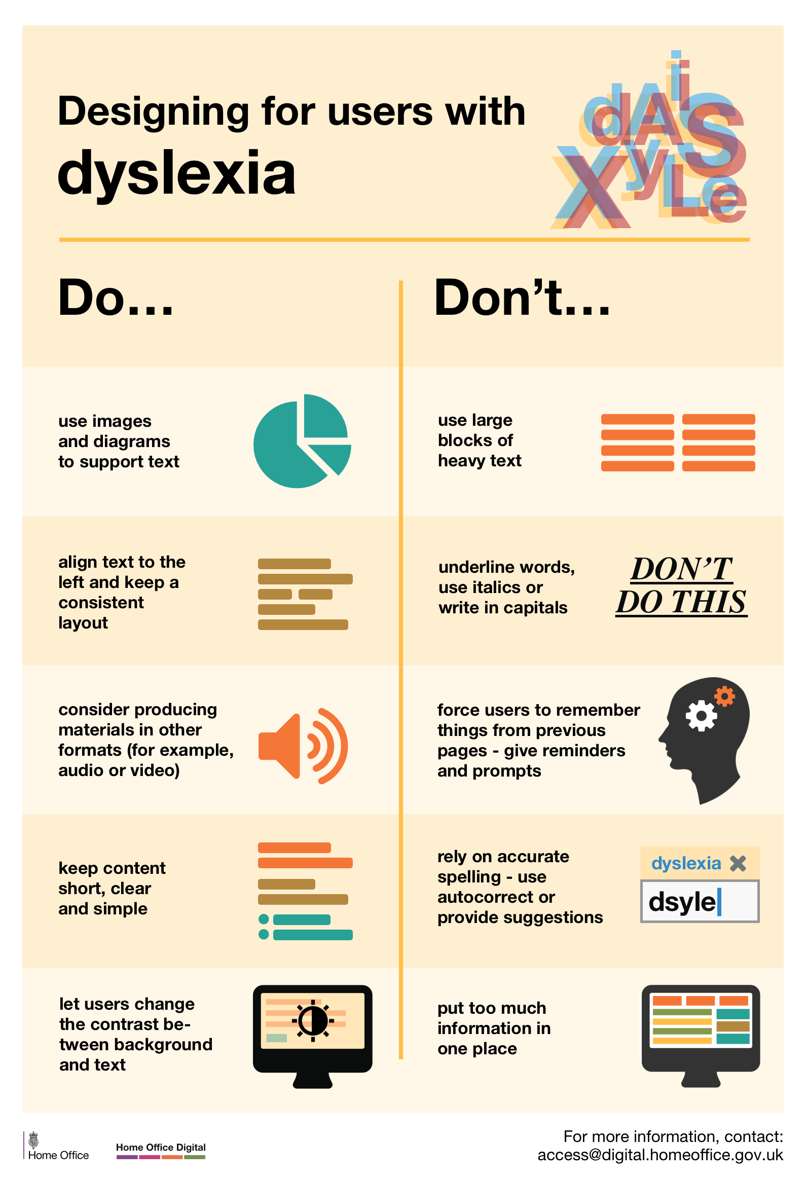
When we design for people with dyslexia, we need to:
- Use images and diagrams to support text.
- Align text to the left and keep a consistent layout.
- Consider producing materials in other formats (for example, audio and video).
- Keep content short, clear, and simple.
- Let users change the contrast between the background and the text.
- Summarize longer documents in bulleted lists or similar summaries.
- Offer extra time and clear questions, especially if asking the user to take a test or exam.
We need to avoid:
- Using large blocks of heavy text.
- Underlining words, using italics, or writing in all capitals.
- Forcing users to remember things from previous pages. (Give reminders and prompts instead.)
- Relying on accurate spelling. (Use autocorrect or provide suggestions instead.)
- Putting too much information in one place.
- Justified text, which creates large uneven spaces between letters and words.
- Double-spacing after periods, which can also cause rivers of whitespace within text.
- Pure black text on a pure white background, which can blur words together. This is a case of where too much contrast can be harmful.
- Long blocks of text such as large paragraphs.
- Serif fonts for body copy, which can cause letter strokes to obscure the shapes of letters.
- Italicized text, because the (sometimes) jagged lines and leaning letters are harder to read. This is especially true of small text.
Own voices
What people with dyslexia have to say about it.
Designer Daniel Britton creates font to show what it’s like to have dyslexia by James Bullen on Stuff describes a font that Daniel Britton, a dyslexic designer, created to try to help others empathize with how dyslexia alters the ability to read. The article also includes paragraphs written in the font.
Benefits of Dyslexia
The Advantages of Dyslexia by Matthew H. Schneps on Scientific American. Tagline is “With reading difficulties can come other cognitive strengths” and that pretty much sums up the article.
Additional resources
- Dyslexia is not just a reading disability by Leslie Templeton on The Mighty.
- Karwai Pun’s Dos and Don’ts on designing for accessibility at Accessibility.blog.gov.uk and the accompanying poster for Dyslexia.
- Designing for Dyslexia, Part 1 and Part 2 by Andrew Zusman at UX Booth.
- Good Fonts for Dyslexia – An Experimental Study by Abigail Marshall at Dyslexia the Gift Blog.
- This software guy accidentally designed an app that is saving my dyslexic son by Jenn Choi on Quartz.
- This is Dyslexia by Kate Griggs.
- 6 Surprising Bad Practices That Hurt Dyslexic Users by Anthony at UX Movement.