WCAG 3.3.1 Error Identification is a Level A guideline that requires us to provide error messages when an input error is detected. Which, I mean, the fact that this had to be written down is kind of sad — and yet I have run into more than a few forms that just didn’t tell you anything at all when something was wrong.
So we have to provide error messages. And writing error messages is hard. If you write an error message that doesn’t actually tell the user how to fix the problem (or that they cannot fix the problem), then you’ve still failed WCAG 3.3.1 because “crap” is the next door neighbor to “nothing”.
Too little information
To get an error message right, we need to write something useful.
This error message isn’t useful.
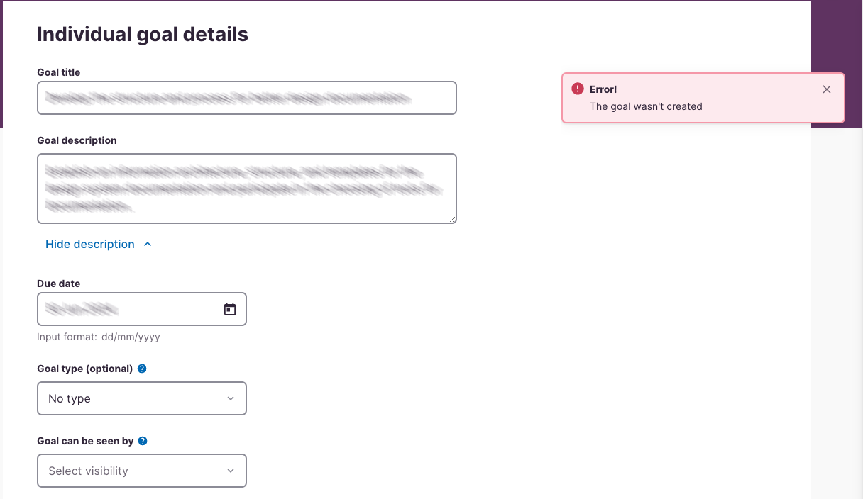
This is a screenshot of an Individual Goal Details page from an HR app. It’s supposed to be used by employees to describe one individual goal they will accomplish over the next year. It includes a goal title field, a goal description field, a due date field, an optional goal type field, and a “goal can be seen by” field.
It also includes an error message toast that says:
Error! The goal wasn’t created
Now it’s good that the system told me — I mean, the user — that the goal wasn’t created. This is good information to have.
It’s not so good that it didn’t tell the user why the goal was created. The user in this case guessed “server problem”, reached out to IT, was punted from IT to HR, and waited a number of days to learn how to resolve the problem.
Hey, did you notice that when I listed off the field names, there was one optional field, but I hadn’t mentioned that the rest of the fields were required? Yeah, that’s because the page gives no indication of what fields are required, thus implying that all fields are required unless they’re explicitly marked optional. Great! Except the user didn’t notice that was the pattern being used and assumed that fields not marked were optional.
Yeah, I hate required/optional patterns that leave anything unmarked. “It’s too cluttered to mark everything.” Bullshit, clutter is information I don’t need. Whether a field is required or optional isn’t clutter. I want to know what the hell is expected of me. Just tell me.
Anyway, this is a great example of an error message that is too vague. If it had said “Hey dingus, you need to provide a “goal can be seen by” visibility value and we’re not saving until you fix it” I would have been offended, but at least I would’ve known what to do.
What would work better?

It also would’ve allowed me — I mean the user — to complete the form a full week before they did, which would have been with HR’s deadlines.
Too much (irrelevant) information
On the other end of the scale, we have this beautiful error message from a supermarket website.
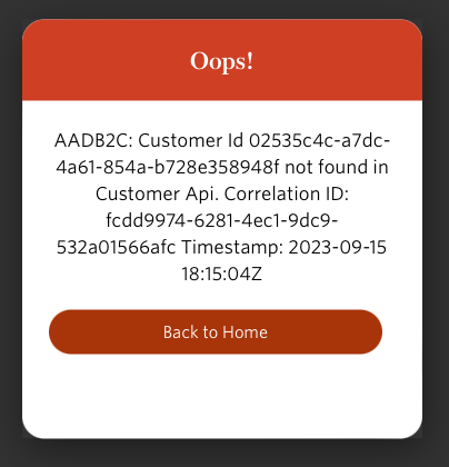
“Users like details!” someone thought, probably followed by “a detailed error message will help our customer support people and engineers know what the problem is.”
Both of these statements can be true and we can still produce a garbage error message.
First, there’s the fact that this starts with “oops!” Hey, I’m not a four-year-old that spilled the milk trying to pour for the first time with Mom’s supervision. I’m an adult who prefers to hear “An error has occurred” or something similarly adult.
Then there’s the message:
AADB2C: Customer Id 02535c4c-a7dc-
4a61-854a-b728e358948f not found in
Customer Api. Correlation ID:
fcdd9974-6281-4ec1-9dc9-
532a01566afc Timestamp:2023-09-15
18:15:047
This is probably incredibly helpful to either the customer service rep or the engineer that works for the supermarket. The user is neither. Notice that the message doesn’t give the user any instruction about what to do with this thing? “Back to home” isn’t so much instruction as an acknowledgement that things are screwed up and you’re not going to fix them, at least as far as you know.
This particular user just stopped using that grocery store for about eight months, which frankly cost the supermarket more money than it bothered the user. Plenty of working grocery store websites in the area. When the user did finally reach out for help, it took customer support less than 15 minutes to fix it. Had they told me that in the error message they would’ve made a lot more money from this user than they did.
Ironically, the best way to fix this one is to include even more detail.
In conclusion
Three things these error messages teach us about writing good error messages:
- Address the end user as your audience, not customer support or the maintenance staff. (You can include information for them, but they’re not your primary audience.
- Tell the user that there’s an error in adult language (assuming your audience is adults).
- Most importantly, tell the user what to do about the error. What action do you expect them to take when they get this error? If there’s a resolution the end user can take themselves, what is it? Who do they call or email if there’s no end user resolution?
Remember, bad error messages cost the business money in support costs, lost sales, and disgruntled customers.
And yes, these are usability issues, but they’re also accessibility issues. If you don’t have a disability, bad error messages might wreck your day for a few minutes. But if you’ve got a significant disability that makes navigating between pages and forms take 10x longer than other people, well, what might be three minutes of annoyance could be a half hour or more without even getting into the effort of contacting support.
Write good error messages.