Repeat after me: a menu is not a dialog. Don’t stick stuff in the menu that doesn’t belong there. For example, this select menu:
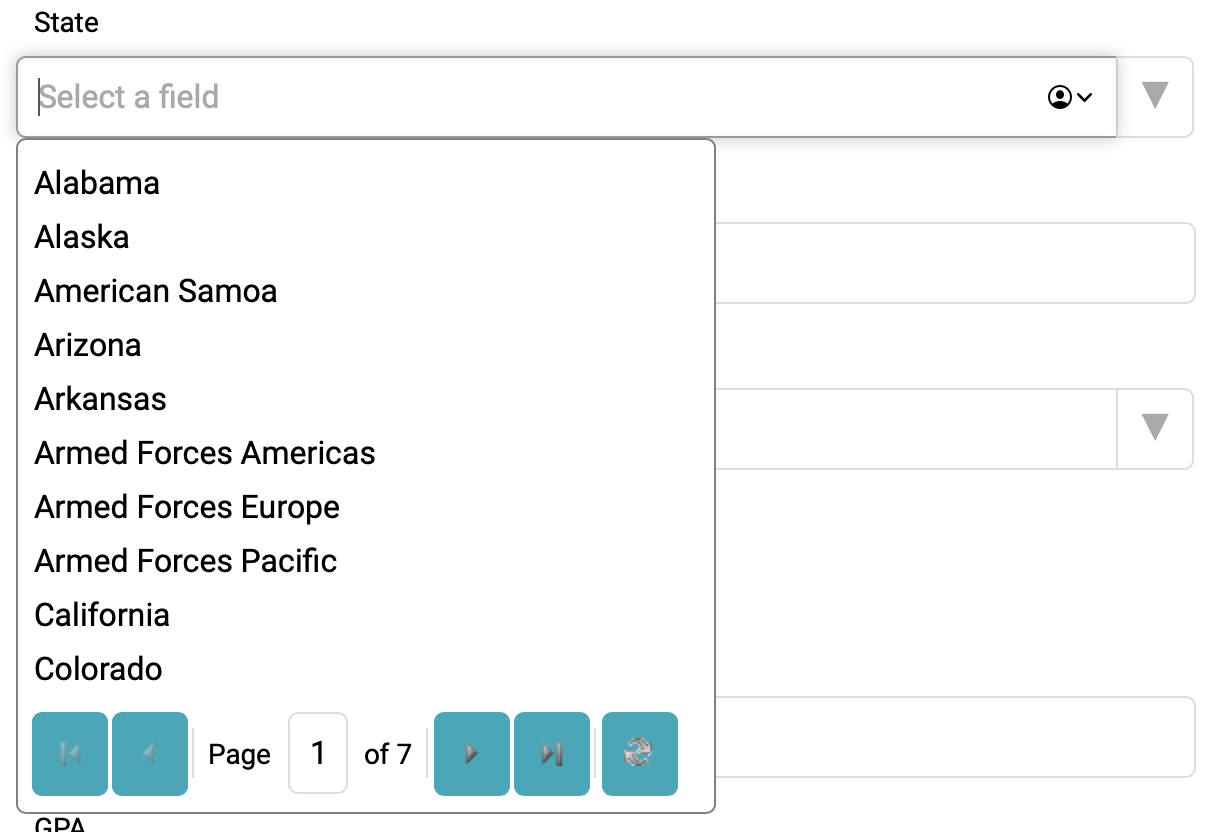
Whoever designed this overthought the process.
They started with a list that arguably is too big to handle a list of elements. Select menus work best with 3-10 items, and really max out at 25 or the height of the screen.
They recognized that the list was too big, but instead of using a different pattern, they decided to put buttons inside the menu’s list layer. If they were using the native <select>, adding buttons wouldn’t be possible, but they’ve decided to roll their own component. So now they’re responsible for all the accessibility as well as the behavior.
They have fallen down on the accessibility side.
- The buttons, which represent first page, back one page, forward one page, forward to the end, and refresh, are grey icons on a teal background. They don’t even remotely pass WCAG 1.4.11 Non-Text Contrast – Level AA.
- The buttons and page number fields aren’t keyboard accessible. That breaks 2.1.1 Keyboard – Level A.
Now, ironically, neither of these failures actually blocks a person with disabilities from using the field because they can still just type in the state that they want and it will filter to that state.
Which raises the big question: if people restricted to have to use filtering, and filtering is the easiest way to choose a state, why bother with the pagination at all?
What they’ve really built, for a keyboard-only user, is an Autocomplete pattern where a filtered set of options displays as the user types. Which works for everyone. And this is a scenario where the user is filling out their own address, so we can be pretty confident that they know what state they are in.
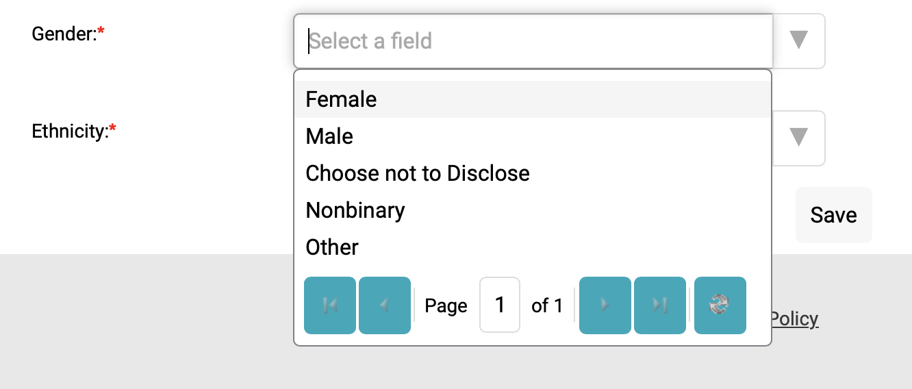
Worst of all, they don’t just use this component when it’s a long list. They use it for short lists too.
The moral of the story is that it’s easier and more efficient to use either a Select menu correctly or an Autocomplete for filtering than it is to try to force a select menu to do things that they’re not designed to do.