Don’t rely on color alone
If you are going to identify something by color, ensure your designs use both color and a text label for that item.
Examples of problematic areas include:
- Changing the color of a form field red when it’s in an error state without changing the label or showing any other identification.
- Displaying a chart or graph that uses color to differentiate between different data sets or values and has no text labels.
- Showing financial gain or loss by changing the color of the dollar value without including a plus or minus sign or other indicator of direction.
- Changing the color of the text or icon on a tabset without ensuring the “selected “and “deselected” states have sufficient contrast between them.
- Using the same color text for links and body copy.
Use readable contrast for text
The goal of text is to communicate. If the text isn’t legible or readable then it doesn’t fulfill its goal. There are many aspects to what makes text legible or readable, and we’re only concentrating on the ones that involve color here.
Text size is important when considering readable text color. Small text (which the Web Content Accessibility Group (WCAG) defines as under 18 points at regular font weight, or under 14 points at bold font weight) must have a higher contrast ratio than large text.

Points are defined as a print text measurement, and points are bigger than pixels.
- 18 point text = 24 pixel text.
- 14 point text = 19 pixel text.
For a quick chart of size comparisons, see Approximate Conversion from Points to Pixels by REEDDESIGN.
To satisfy 1.4.3 Contrast (Minimum) – Level AA, small text must have a contrast ratio of 4.5:1 between the foreground and background. This ensures that users with Visual Disabilities (including color vision deficiency) can differentiate the background from the text.
Large text must have a contrast ratio of 3:1 between the foreground and background, for the same reasons.
If aligning with 1.4.6 Contrast (Enhanced) – Level AAA, small text must have a contrast of 7:1 and large text must have a contrast ratio of 4.5:1. This high contrast is not required for the majority of audiences, which is why it’s a Level AAA guideline. With the exception of some people with Dyslexia, most folks find reading higher contrast easier than reading lower contrast, especially for body copy. In other words, more contrast is (generally) better.
When measuring the contrast, ensure that you’re measuring at the “worst” point against the background. Backgrounds consisting of patterns, images, or gradients may have shifting levels of contrast, and the guidelines above represent the minimum, not the average or the “everywhere but this edge of the page” measurement.
See Testing Tools for a list of color contrast testers.
Link color
Links can be especially problematic. To ensure that someone with Color Vision Deficiency (CVD) can differentiate a link from the background of the page, it must not use color alone. This can become more complicated than it sounds.
The short answer is “traditionally, we underline links.” (Also, developers, we identify them as links programmatically.)
Using underline is simplest because a) the earliest web browsers used this method, so everyone’s familiar with it and b) you’re probably not using underlines in your typography if you have italics available so it’s “safe” to override the meaning of underline from “might be a title or might be emphasis” to mean “probably a link”.
The slightly longer answer, especially if you are one of (many!) graphic designers that I know that don’t like how underline is implemented is “Have you seen text-underline-offset, which makes underlines look less crappy, has shipped in Firefox and Safari, and is set to be underway in Chrome before the end of 2020?”
To satisfy 1.4.1 Use of Color – Level A you don’t have to use an underline, or use an underline all the time. You “just” have to use something that differentiates links from non-links. It could be font weight, italics, font size, font family…
The trick to using anything other than underline is that you’ll be teaching your users on the fly to recognize links by something other than underlining.
A few years ago, that would’ve been a huge deal but these days a lot of websites are ditching the underlining for bold — or for just a color change.
Yes, “just a color change” is an option, but only in specific circumstances. If you want to use only color change and no other visual cue that something’s a link (in the “link” or “nobody’s hovering on me” state), you must:
- Have a 4.5:1 contrast ratio between the body text and the background to meet 1.4.3 Contrast (Minimum) – Level AA and/or 1.4.6 Contrast (Enhanced) – Level AAA)
- Have all of the following features to meet 1.4.1 Use of Color – Level A
- Have a 3:1 contrast ratio, providing luminosity contrast, between the surrounding non-link text color and the link color so that users can identify links in a paragraph without an underline. (The Web Content Accessibility Group has posted a list of links with a 3:1 contrast ratio with surrounding text.)
- Ensure that on hover, a visual enhancement such as underline, font change, etc. is displayed.
- Ensure that on focus, a visual enhancement such as underline, font change, etc. is displayed.
- Ensure that programmatically, the link still identifies itself as a link, to meet 1.3.1 Information and Relationships – Level A.
Complicating all of that, as if it wasn’t enough, is that you have to take into account all your other uses textual visual enhancements. These are places where it’s handy to have a design system list what tags result in what textual changes, so that you don’t find out you’re using “bold text” for <code> , <kbd>, <samp>, and <a>, then giving someone instructions, ask-me-how-I-know.
“But anne, why is all of this necessary when users should be able to tell by the context what a link is?”
- Because you are not your user. What’s obvious to you may not be obvious to your user.
- Because you are probably not your user with a reading disability, where the very act of understanding context is the part that’s got the disability.
- Context is only one piece of textual communication – albeit a very big one. Anything we can do to help context along helps everyone, and especially helps people with cognitive and neurological disabilities.
Additional link resources
- TextDecoration – Example of text decoration methods on Codepen
- Why are hyperlinks blue? by Elise Blanchard
Effective use of color
- Our World in Data was recommended by Noah Glushien as a site that is designed well for everyone’s vision, not just people with CVD.
Ensure the focus indicator is visible
Every item that the user can interact with must have a visible focus indicator when the user has moved the keyboard focus to it.
We can meet Guideline 2.4.7 Focus Visible – Level AA by ensuring that we’re using HTML elements and that the browsers we’re targeting all display focus indicators by default. That’s a really low bar. It also may not work in our favor. The focus indicator in both Safari and Chrome displays as a blue shadow-like outline around the element receiving focus, which can be problematic when the website’s primary colors are already blue. (As noted by Adobe in 2016, blue is the web’s most popular color.)
An element’s focus state can be styled using CSS, fortunately, so we can change the color to truly contrast with its surroundings, making it easy for the user to spot. Note that in order to pass Guideline 2.4.7 Focus Visible – Level AA we also have to pass Guideline 1.4.11 Non-Text Contrast – Level AA with that focus indicator, which means a minimum contrast between the focus indicator and the background of 3:1.
Style UI Components
Guideline 1.4.11 Non-Text Contrast – Level AA also directs us to have a minimum level of contrast (3:1) between two adjacent colors in UI components and meaningful graphics to ensure that users can tell them apart.
This includes:
- Icons, if their meaning is critical to understanding.
- Buttons, tab sets, etc. so that users can tell what the clickable area around the object is.
- Text and images of text that are next to each other where some are interactive and others are not (for example, a link list).
- Visual elements such as the divider between breadcrumbs, which indicates hierarchy between the breadcrumbs.

Here’s an example of a failure state:
On the Trees example site, a gallery of tree pictures contains a set of filters. Each filter has an icon and text. The filter you have selected is a different color than the filters that you haven’t selected — and the selected filter is not interactive, because it’s the selected state.
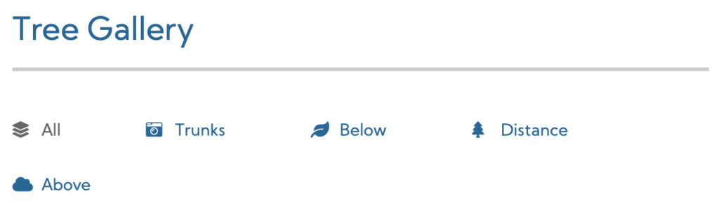
The color contrast between the selected state, at #666666 and the non-selected state at #006699, is 1.08:1. People with the forms of CVD that can’t tell blue from grey by color won’t be able to use the luminosity of the two choices apart because they’re too close.
Bonus points for failure go to whoever decided that there would be no hover state on the tabs, so those with more extreme forms of CVD have no indicator at all that these are interactive.
Another example comes from the Google Material text fields page.
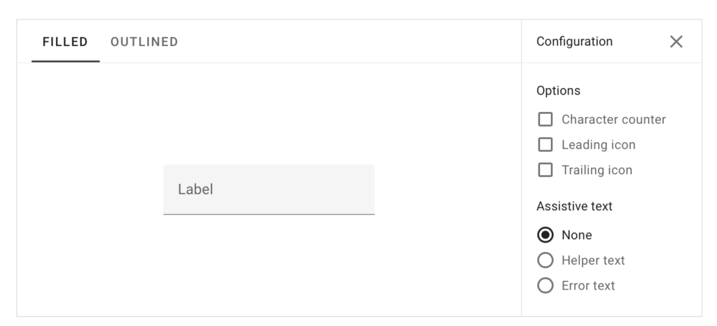
In the screenshot above, the text field’s background is a light grey (#f5f5f5) on a white (#ffffff) background. To move the cursor into the field (using mouse or touch device) one must tap on the light grey area. But the contrast is 1.09:1.

Now, there is a bottom border, so you know the lowest area to tap, but for many people with even moderate vision issues, such a low contrast can mean not being able to identify how high it’s safe to tap.
For the user, it’s the insidious combination of a visual disability and a motor disability that causes the most trouble — what if I can barely see the grey background, and I have trouble with fine motor control?
The ideal solution would be a border (which Material makes available on the other tab) — assuming the border meets the 3:1 contrast ratio.
Charts and infographics
When presenting charts and infographics, it can be challenging to ensure that all of the data is on the page and simultaneously doesn’t look cluttered.
On the other hand, well-designed data labels not only make information accessible to some people with disabilities, they aid understanding for everyone.
Do provide data labels and values as close to data as possible
A good chart uses proximity to tie data values to their visual representation. If the labels are too far from the data, someone with Low Vision using a screen magnifier may have to scroll back and forth between the data and the legend to try to understand the chart or infographic.
Similarly, if the user is expected to estimate the data values in a pie chart by comparing the sizes of the slices, the screen magnifier user may not be able to fit the entire chart in their viewing area at one time.
By providing data values with the labels and next to the pie slices, we make it easier for all users to see and compare values.
Don’t depend on color to tie together a chart’s data values and its legend.
Microsoft Excel charts, by default, use color to draw a chart, and then place a legend matching colored blocks to the label off to one side.
While color helps users identify the boundaries between values, using color alone to identify data values violates 1.4.1 Use of Color – Level A. This is especially true when the number of data elements grows, because it’s extremely difficult to find 5 or more colors that have enough contrast with each other to meet 1.4.11 Non-Text Contrast – Level AA.
In other words, if you break 1.4.1 by using color alone to identify information, then you’re relying on 1.4.11’s contrast guidelines to making your chart or infographic usable… and you’re making the palette of colors you can use much smaller.
Additional Resources
- List of 20 simple, distinct colors by Sasha Trubetskoy
- Accessible but Never Boring by Steph Smith at Wise