Screen readers are assistive technology (AT) that read the content on the screen aloud or present it on a Braille display. Most people who use screen readers have Visual Disabilities (although not all people with visual disabilities use screen readers and not all screen reader users have visual disabilities).
Writing for screen readers means writing instructions with the assumption that your reader can’t or won’t see the screen. Instead, they will hear (or read) the output.
Make sure all content is accounted for – even if it’s not written.
The first rule of writing for something that will be read aloud is to ensure that all of the content on the page is accounted for, even if it’s not written content.
For example, the warning messages on this site display an icon indicating that they are warnings. Information messages use the same structure, except visual cues in the form of an icon and a color change indicate that they are different from warnings. If we don’t provide alt text on the icons to indicate their type, people using screen readers would be unable to differentiate between the severity of the two messages.


This doesn’t apply just to icons or images. Anything that’s visual or unclear, whether it’s the layout of a table, a chart, the purpose of an interactive element, should have a text alternative provided.
This doesn’t mean the text alternative must be visible on the page. In the case of icons and images, we can use alt text or titles to describe the content. In other cases, we can create the text and hide it visually while leaving it available for screen reader users.
Don’t repeat yourself
The second rule of writing for something that will be read aloud is don’t repeat yourself.
On our Trees example site, the global navigation text is accompanied by an icon. In most cases, the icon and the text have the same intention, and the icons themselves are provided for easier scanning and visual emphasis.
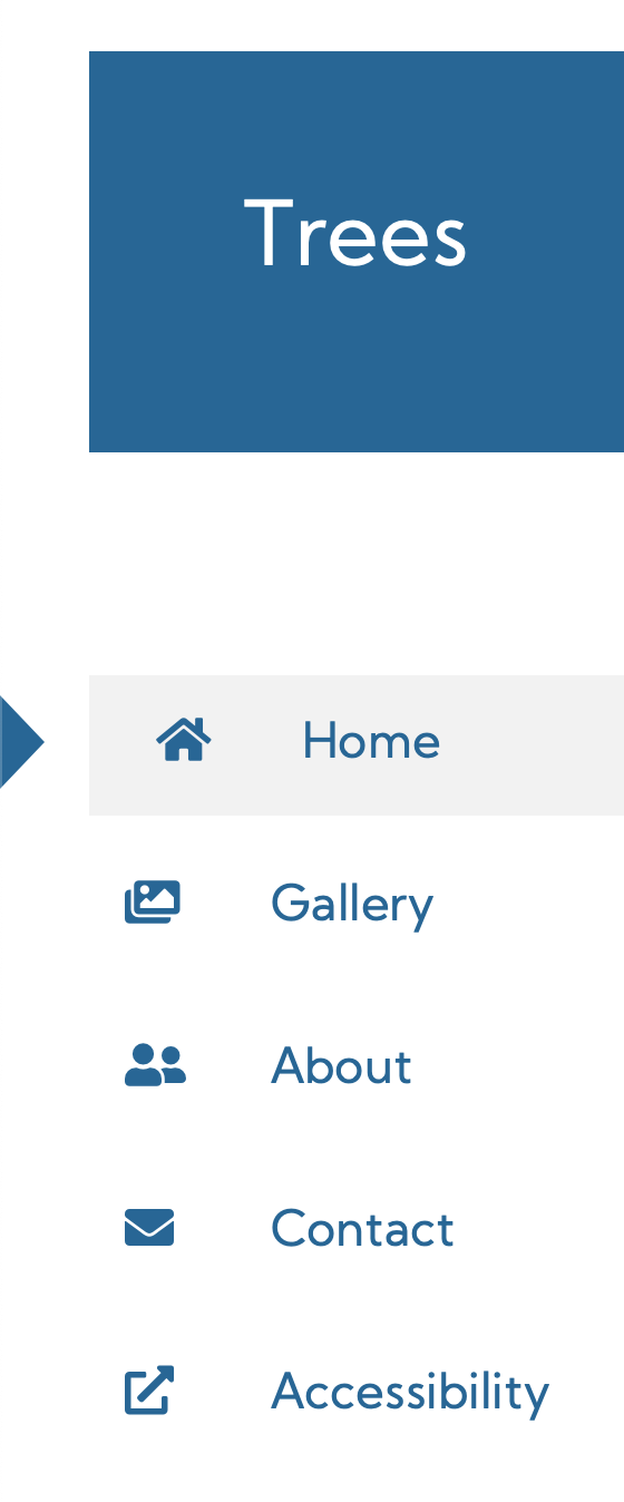
If we were to describe each of these icons in turn to users, we’d sound either repetitive or confusing.
For example, if we described the icons by their purposes, our user would hear something like “Home. Home. Gallery. Gallery. About. About. Contact. Contact. Opens in a new tab. Accessibility.”
If instead we described the icons by their presentation, our user would hear something like “House. Home. Pictures. Gallery. People. About. Envelope. Contact. Box with an arrow in it. Accessibility.”
Neither of these descriptions are particularly useful.
When we look at this set of icons, we see that the only one that adds important information to its menu choice is the last one, which indicates that the Accessibility link will go to a new tab.
Ideally, we want our user to hear “Home. Gallery. People. About. Contact. Accessibility, opens in a new tab.”
Depending on the implementation this can be done in a number of ways. In the Trees example, we intentionally did not label the font icons on the menu items except for Accessibility, where we added an aria-label to the anchor tag.
Note that this also doesn’t just apply to icons or images. One frequent offender on the web is title content. For example, if we had both alt text of “Home” and a title of “Home”, on our Home menu item, a screen reader could potentially read “Home Home Home”. No no no.
When it comes to title fields or “tooltips”, less is more. Don’t provide them unless the situation requires it.
Screen readers generally announce the type of element they’ve got highlighted, as in “George Washington. Image.” or “CNN.com. Link.” Don’t tell the user what they’ve focused on.
See Accessible Names for more guidance on what determines the accessible name of an object on the page.
Punctuate wisely
Most screen readers read important punctuation, like the @ symbol in a email address, by default. Common punctuation marks such as periods or question marks, on the other hand, are read as a person would. The voice pauses or rises accordingly. It’s a good idea to listen to a page on a screen reader to understand how your content will be read.
Don’t override screen reader pronunciation
Screen reader users know that some elements are mispronounced or handled in ways that non-users don’t expect. Changing the code so that something will be pronounced a specific way can cause bugs. Accepting the mispronunciations is not a bug. Read more at Don’t Override Screen reader Pronunciation by Adrian Roselli.
Know what screen readers don’t read
Emphatic elements
HTML contains semantic elements for emphasis and strong text: <strong> and <em>. Unfortunately, today, screen readers don’t express these elements by default. (Some have settings to turn on, but they’re not easy to locate.)
We should still use semantic HTML so that if screen readers pick up this functionality in the future we don’t have to remediate our sites. (See Why does it matter if our HTML is semantic? for more on this topic.)
If the emphasis of the text is critical to understanding (and only if it’s critical), we should plan to add additional text to the page for people using screen readers. This could be through:
- Updating the text for all users (such as adding the word “Important:” to the front of the emphasized content).
- Adding text that CSS then hides so it only is read out to people using screen readers.
- Adding an icon with appropriate alt text.
Read over Are inline elements (see list) marked up correctly? and Scott O’Hara’s article, Inclusively Hidden, for a better understanding of how the later two techniques can be implemented.
Code
The <code> and <pre> elements are also inline markup that screen readers ignore. (The <pre> element is one of the rare surviving visual-only tags and doesn’t provide semantic meaning.)
Like <strong> and <em>, <code> conveys significant benefit to sighted readers, so it should definitely be used. Once again, if it’s critical for the user to know that a specific set of text is code or how it’s formatted, use the techniques described above to describe these elements.
Quotes
The <blockquote> element is recognized by screen readers, so if you’re posting a long quote, use that element.
The inline <q> element is not recognized, so at the moment per Deque University there’s no significant benefit to either the user or us as writers, designers, and developers to set off on a journey to update all the quotes in our respective systems to use this element. Standard quote marks (““) are fine.
Inserted and Deleted text
If this isn’t implemented correctly, it results in a High level defect.
The <del> element indicates that the text inside the tags is marked to be deleted. The <ins> tag indicates that the text inside the tag should be added. Both of these tags are frequently used for “track changes” scenarios for source code, Google Docs, etc. Screen readers read the text between the tags, but not the fact that it’s been deleted or added. If you don’t provide an alternate way to identify the deleted and added text, the user will be quite confused.
Let’s say that we’re providing a tool for our customer to update the content on the example Trees website, and the tool allows them to see edits from their botanist experts before publishing the text.
The original text may say:
Trees are annual woody plants with long trunks.
The developer may correct the text to indicate that it trees are perennials, not annuals, which would result in the deleted text being struck through and (in this example) the inserted text being marked in bold text:
Trees are
annualperennial woody plants with long trunks.
Because the <del> element is ignored by screen readers, what the user will hear in a screen reader is:
Trees are annual perennial woody plants with long trunks.
Obviously, this isn’t what we want. Whoever hears that jumble of nonsense won’t know which one is supposed to be kept and which one is supposed to be deleted, especially if it’s been weeks since they wrote the original.
Using the visually-hidden technique described in the Emphatic elements section, we could instead update the content so that
Trees are
annualperennial woody plants with long trunks.
would be read aloud as
Trees are begin deleted text annual end deleted text begin inserted text perennial end inserted text woody plants with long trunks.
Thus, the user would know what edits were made to the content, and would be able to complete their task.
Marked text
If this isn’t implemented correctly, it results in a High level defect.
The <mark> element indicates that the text is marked or highlighted for reference purposes. Frequently this is used to mark the search term you searched for in the text, or that a comment is associated with the term (in, say, Google Docs).
Screen readers read the text between the tags, but not the fact that it’s been marked. If you don’t provide an alternate way to identify the marked text, the user will not know what has been marked, which may prevent them from completing their task.
Once again, our best method for remediation is to add visually-hidden text that indicates the beginning and end of the highlighted area. For example if the user were to search for the phrase “shrub” on the Trees site, we would expect the example snippet to have a visual display similar to:
There’s no definition for shrub, either… …Wikipedia says small trees are classified as shrubs…
However, without additional hidden text, the user wouldn’t know that the phrase “shrub” was highlighted.
To properly present this material, we would want the screen reader to read:
There’s no definition for begin highlight shrub end highlight either… …Wikipedia says small trees are classified as begin highlight shrubs end highlight…
Additional Resources
- How to create content that works well with screen readers by Leonie Watson on the Gov.UK blog
- Screen Readers support for text level HTML semantics by Steve Faulkner at TPGi