When it comes to accessibility concerns, an image on the web is used in one of three ways:
- Interactive or actionable images such as links or buttons
- Informative images that add understanding to the page
- Decorative or redundant images
Note that the types of images we’re discussing here have nothing to do with the file type. Whether your image is an PNG, GIF, SVG, font icon, or something else, it will still be used in one of the three ways stated above.
Interactive or actionable images
Interactive or actionable images are images that are the whole content of a link, button, or other control.
Why use interactive or actionable images?
In general, it is best to ensure that icons have text labels. (Nielsen Norman Group explains why in Icon Usability.) There may be situations (especially on mobile views or when lacking screen real estate) where providing an icon without a text label is best of a set of less-than-ideal solutions.
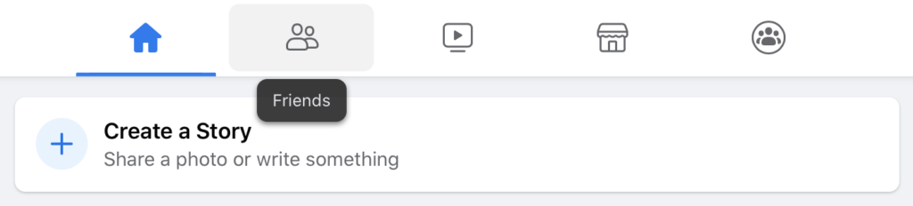
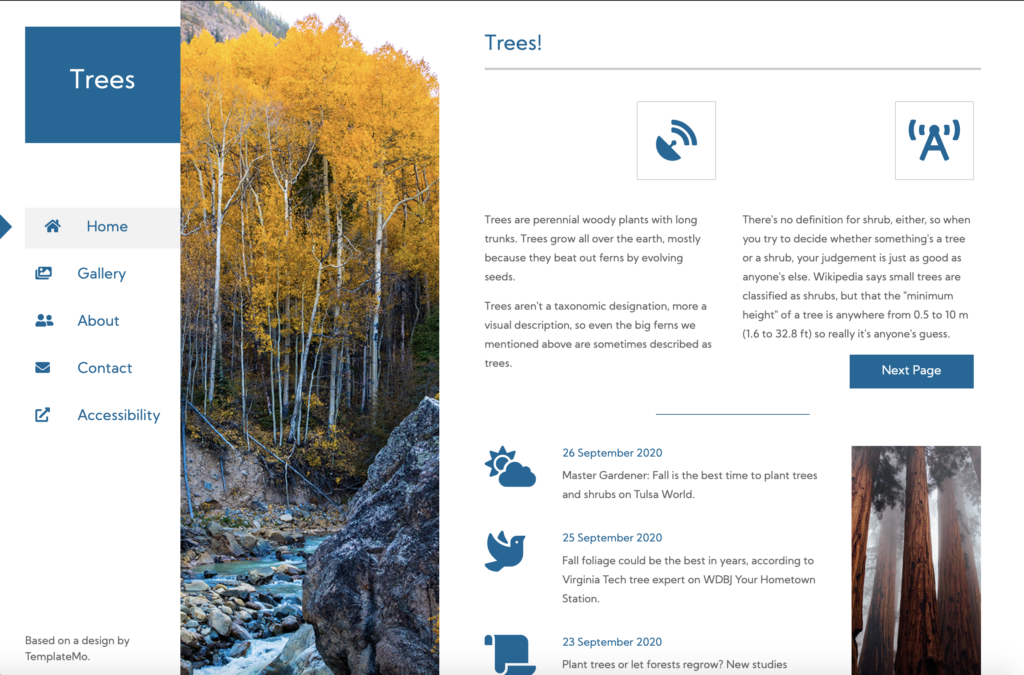
The following example from Facebook’s new (October 2020) design shows a tabset at the top of the page with icons for home, friends, watch, marketplace and groups. (Note: I never said it was a good example.)
Each icon has a change in background on hover, and both a background change and a visible outline on focus. In each case, the img is the full content of the <a> element. (There is a text label that displays below the icon on hover or focus.)
How to implement interactive or actionable images
Because the icon represents the full content of the actionable control, the image must have alt text. See Image alt text and SVG titles for writing quality alt text.
Interactive or actionable images should be implemented as foreground icons. For more information, see Is the icon or image correctly implemented as either an inline SVG, foreground image or background CSS attribute?
Informative images
Informative images are images that add understanding to the page. If you remove them, the page makes less sense than it did when they were present.
Why use informative images?
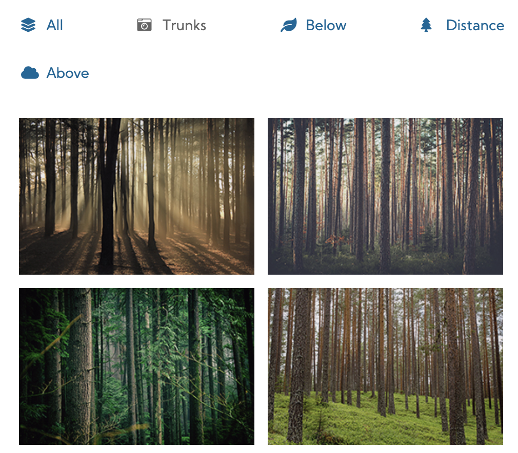
The most obvious way that informative images improve presentation is by providing a picture of something. For example, on the Trees example site, we have a gallery of pictures of tree trunks, so that sighted users can see the variety of trunks available.
Whether it’s a photograph, an illustration, or an infographic, the best way to provide information about what something looks like, how something behaves, or the relationship between multiple things, is via imagery.
Another way that informative images (particularly icons) improve presentation is by converting a repeated phrase into an image. For example, here’s a warning banner for this site:

By implementing the alert as a foreground icon and including alt text, I provide the warning content for both sighted users and users with visual disabilities. Because I provide the icon, I don’t need to start every alert with “Warning!” text that identifies the alert’s severity. If I took the icon away, I would have to modify the text next to it to make up for the change.
In both of these instances, removing the image (and not replacing it with an alternative) would make the content incomplete or less understandable.
How to implement informative images
If the page is incomplete or doesn’t make sense without the image, the image must have alt text. See Image alt text and SVG titles for writing quality alt text.
Interactive or actionable images should be implemented as foreground icons. For more information, see Is the icon or image correctly implemented as either an inline SVG, foreground image or background CSS attribute?
Decorative or redundant images
Decorative or redundant images are images that don’t add information to the page. This doesn’t mean that they’re unnecessary.
Why use decorative or redundant images?
Imagery draws the eye, so well-designed imagery can draw a sighted user’s attention to specific information.
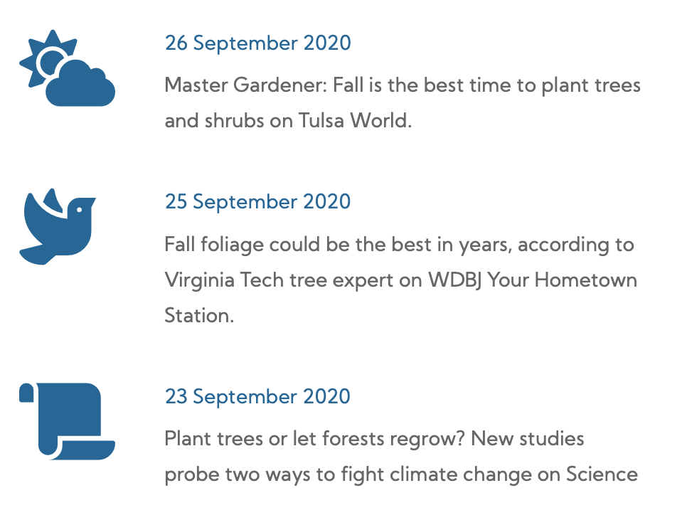
For example, the icons on the Trees example site news boxes draw the eye to the news, and differentiate three text-heavy content containers from each other. In this case, the images are purely random, and have no direct connection to the news itself.
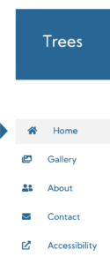
Imagery can also make information easier to scan. In the Tree example site global navigation, different site silos are communicated with different icons. Even though the iconography’s meaning (roughly) matches the text next to the icons, the icons make it easier for a user (who’s familiar with our iconography) to scan over the list and find the menu item they need.
Finally, imagery provides visual interest in what otherwise might be empty white space. For example, the Trees example site uses a vertical rectangle about a third of the width of the page to divide between the global navigation and the page content. The design calls for the page to contain a photo — in this case, of course we went with a photo of a tree. The type of tree, setting, and other information about the photo is irrelevant to the use of the site. It’s strictly present to break up the page sections.
How to implement decorative or redundant images
The best practice is to implement these types of images or icons as background icons. For more information, see Is the icon or image correctly implemented as either an inline SVG, foreground image or background CSS attribute?
alt=””) or an aria role=”presentation” attribute so that they aree not read aloud on screen readers.Exception case: meaningful background images
Let’s say that you are designing something that has a lot of repetitive images, such as a file tree (file directory) full of folders and arrows indicating whether the directory’s contents are visible or hidden:

File tree screenshot courtesy Vitaly Zdanevich / CC0
As the designer, you don’t know how many folder icons or arrows the file tree will display, because it depends on how many child directories your user creates. It could be one of each icon, it could be hundreds.
Arguably, the folder is decorative anyway. But the accordion arrow is an interactive element, so according to our rules above, it should be a foreground image.
If the icons are implemented in the foreground, your webpage may be making hundred of calls to the cache (or worse, the server) to load the icons for each directory.
Developers generally frown on this because it causes poor performance and can impact the servers in other ways. Obviously, lousy performance is bad user experience, so UX Designers should be against it as well.
The Developer may request to place the folder image into the background where it will be called once, by the CSS file, and then reused throughout the page without affecting performance.
In a case like this, HTML and CSS give us ways to label the container with the background image. The developer can add an aria-label to the container allows the assistive technology user to know what they’re clicking without causing a performance issue for everyone. It’s not ideal, because the aria-label attribute is only available to assistive technology (unlike alt text, which many users can view by hovering on an image).
How to document the type of image
Keeping an icon library or inventory of existing implementations can not only assist you in communicating which icon to use, it can also prevent you from creating multiple icons that do or mean the same thing. (For developers, it can also prevent loading the same icon into the server six times under six different names.) An iconography inventory should include all of the currently-used icons, their usage, and the method of implementing them for that specific usage.
Similarly, keeping an illustrative image gallery of existing implementations can help you track the visual style of imagery.
If it’s a new icon or image, then as the UX Designer, you may be responsible for having it added to the icon library or the image gallery. You may also call it out in your documentation during wireframing or writing Agile stories for the specific task.