When navigating a page by keyboard, users expect the focus order and the reading order to match. In other words, you should tab through the interactive elements on the page in the same order that you would read the page.
The difference between Reading Order and Focus Order is that the reading order documents the content containers regardless of what they contain, and the focus order documents the interactive elements, not all of the content.
A basic example
For example, if you were documenting the Rocks homepage for reading order, you would include the site title and all of the elements of the global header, then the text at the bottom of the image carousel, then the text content of each of the categories.
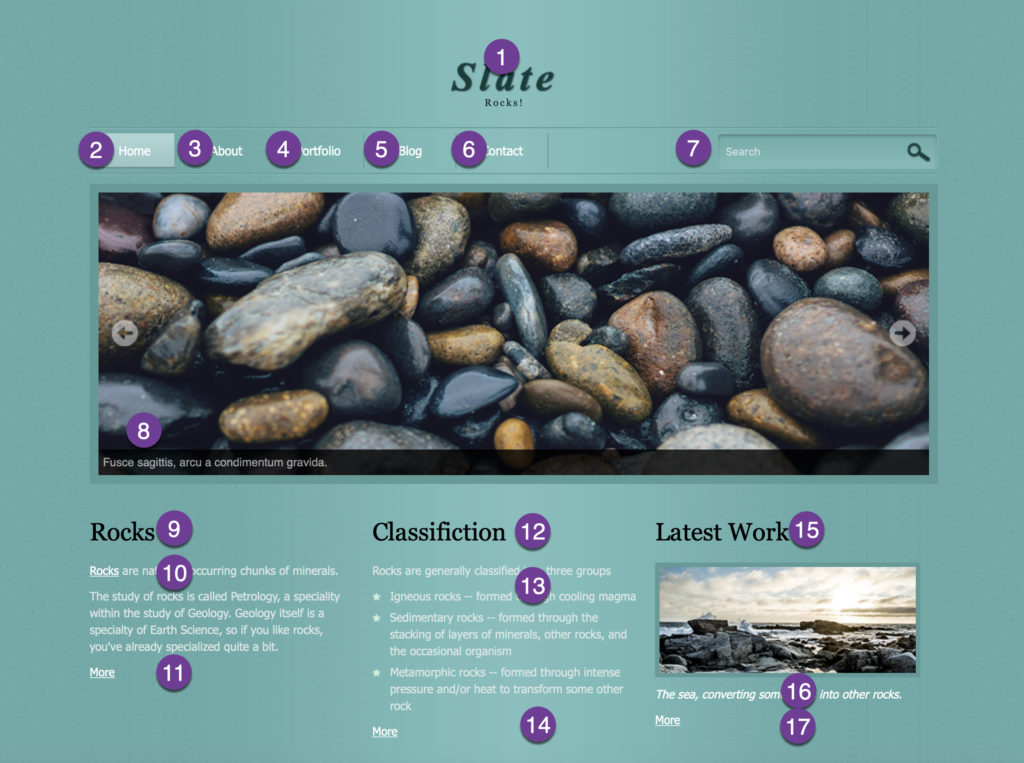
If you were documenting this same page for focus order, you would still include all of the interactive elements of the global header. You would include the interactive image carousel controls. You would skip most of the content in the categories, calling out only the links in the content and the “more” links at the bottom of each one. You would also include the clickable image in “Latest Work”.

When documenting either reading or focus order, ensure that the development team receiving the documentation understands which one you’ve documented and what the difference between the documents is.
A more complex example
The Rocks website is pretty straightforward because the content is structured horizontally starting at the top of the page. English speakers read in roughly an F-shape, scanning from the top left of the page across the page then down a little, then across a bit, then down, etc.
The Trees website, however, isn’t structured that way. It’s structured with the global navigation running vertically down the left side of the page, but the content still starting at the top.
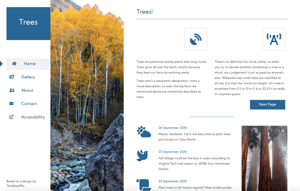
Does the reader’s eye start with the section header that says “Trees!” up to the top right, then move to the global navigation at the left, and then back up to the content in the first section? Or do they read the first section, then explore the global navigation, then sweep down the page in the rightmost column? When do they see the footer in the bottom left corner telling them where the template was found?
When we’re designing for readability, the visual confusion this layout causes might not be a major concern, but once we layer on tab order, we can see the conflicts arise.
For example, the tab order for the Trees site goes from the page logo (Trees) through the global navigation and then straight down to the footer indicating the designer. If we were listening to the page and we went from the navigation straight to the footer, we might think the rest of the page hadn’t loaded yet, only to find that, actually, it had, but it’s after the footer content.
This doesn’t mean that the layout is inaccessible or won’t work. It does mean that both reading order and focus order need to be documented because the Document Object Model (DOM) order, to be accessible, must follow suit.