Today on “Show me a surprise assistive technology”, I’d like to introduce you to the Clax cart 1 2.
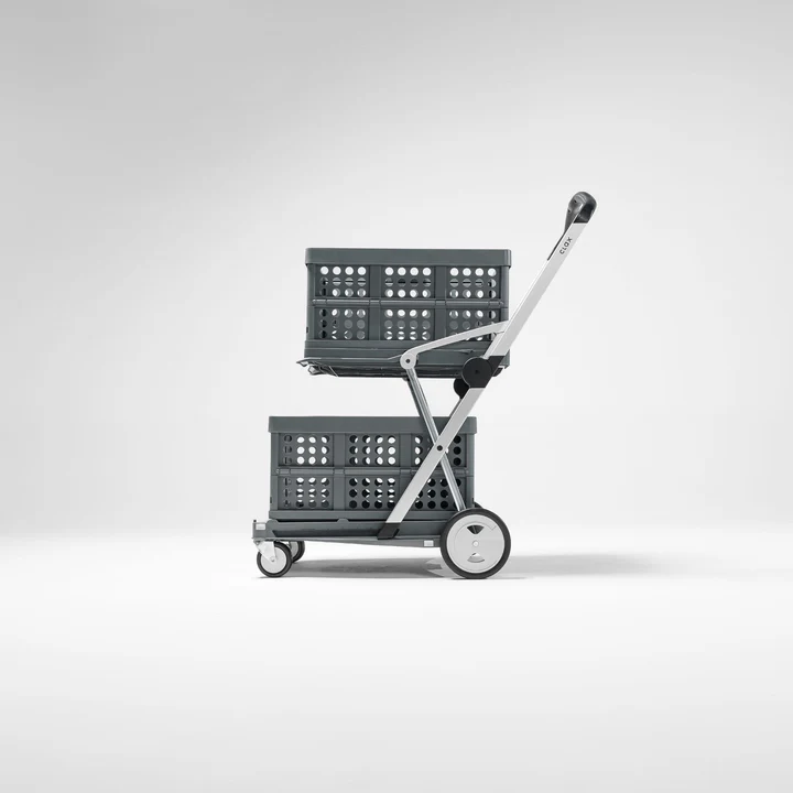
Maybe this isn’t a thing that you would consider an accessibility tool. It looks like any other cart or buggy or trolly or whatever term you’d like to use. Sure, it doesn’t have the hard sides of a grocery cart, but it does resemble some of the smaller ones…. It has an upper shelf, a lower shelf, and a handle. Yup, you might be thinking, that’s a cart right there.
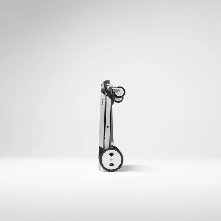
Well, except that this one folds completely flat. Not only does it fold completely flat, the crates (one comes with it, others are available for purchase) also fold completely flat. That means it’s easy to transport in a vehicle. It’s also easy to carry since it’s lightweight (for a cart) and once it’s folded into position it won’t unfold without using the release button on the handle.
You can fold it and unfold it with one hand, using the button on the handle, assuming you have that level of mobility.
It also has a brake on the back which you can lock and unlock with your foot by pushing down or pulling up.
The top shelf folds up to fit between the arms of the handle, but without blocking use of the handle itself. That way if you have big, tall, or long things to transport, you can still use this cart.
There are hooks attached to bungee cords connected to each shelf. They stretch up to hook onto the crates (if you choose to use them) to ensure that the crates don’t go flying off in any direction when you’re steering them around.
Still not striking you as assistive technology?
Last year we moved from a multi-level home to a one-floor (“ranch”) home. Part of that decision was made because a member of my family has significant mobility issues and couldn’t walk for more than about ninety seconds unsupported without significant pain.
This cart is not a walker, no would i encourage anyone to use it as such.
It does, however, help my family member immensely when they want to move from their bedroom to the living room to join the family watching tv or eating dinner. They can pile everything in the bedroom they might want to have with them for the next three or four hours into the cart, then roll it into the kitchen to load up on food, drinks, etc., then roll to the living room, where they can park the cart and take out the things they want or need. What used to take three or four trips back and forth to different rooms, all while shaky on their feet and using a cane, can be carried by the cart in one trip.
Cutting down the number of trips not only significantly lowered my family member’s frustrations with their body pain and immobility, it also cut the amount of time it took them to get from the bedroom to the kitchen and then to the living room down significantly. They don’t feel like they’re holding the rest of the family up because they can’t move fast enough anymore.
Because the cart folds very flat, it fits in the back of my 2016 Mini Countryman without me having to put the seats down. That means I can take it anywhere. Anywhere means that when my husband was in the hospital, I was able to move his belongings in and out of (and sometimes between) hospital rooms without taking six hundred trips to the car. Since I don’t exactly have the best back in the world myself, that cut down on my body pain considerably — and since both the hotel chairs and driving irritate my back pain, anything that could prevent extra trips was a help.
Most of the folks I know who are able-bodied would never think about keeping a cart in their house Sure, they’d pull their hand truck out to move something heavy, or maybe keep a desktop computer or a plant on a dolly, but not a whole cart.
This cart, though, gives people back the ability to move their stuff from one room to another with much less worry about their back pain, their shoulder pain, their ability to carry, their balance, etc. It may not have been designed specifically for people with disabilities, but the ability to set the cart up one-handed, the extra thought put into ensuring that the crates could be clipped on to the cart, the light weight and solid wheels, and the fact that it collapses down to a size that’s easy to store, make it ideal for people who don’t have the time, energy, mobility, or strength to deal with heavier, bulkier, or less-efficiently-designed systems.
And when it’s good for people with disabilities, it’s good for all of us.